SGB Custom Painting Blog
How to Choose Interior Paint Colors That Make Your Home Feel Bigger
Frank White • September 10, 2026 | Chico, CA | USA

Have you ever walked into a freshly painted room and wondered why it suddenly seems larger, brighter, and more comfortable even though nothing about the floor plan has changed? Interior Paint can have a surprisingly strong influence on how we perceive the size of a room. At SGB Custom Painting, we know that homeowners with smaller rooms often assume their only option is to paint everything bright white. While white can certainly work, it is far from the only choice. Soft neutrals, pale blues, muted greens, warm whites, and even carefully selected deeper colors can change the way walls, ceilings, and architectural features relate to one another. Lighting, undertones, contrast, furniture, and flooring all influence the final result. For homeowners considering Interior Painting Chico, the goal should not simply be choosing the lightest color available. Instead, it is about creating a balanced color palette that works with your home's natural light and makes each room feel open, connected, and comfortable.
What Interior Paint Colors Make a Room Look Bigger?
The best Interior Paint colors for making a room feel bigger are generally light or moderately light shades that work well with the room's natural and artificial lighting. Soft whites, warm whites, pale greige, light beige, muted blue, and subtle green can create a brighter, more open appearance because they keep the room from feeling visually heavy. However, there is no single color that will make every small room look larger. Undertones, window placement, flooring, furniture, ceiling height, and the amount of natural light all influence how a paint color appears. Keeping contrast relatively low between walls, ceilings, and trim can also create visual continuity, making boundaries less prominent. Cooler colors may sometimes appear to visually recede, while carefully chosen warm neutrals can create an airy, comfortable atmosphere. Homeowners planning Interior Painting Chico should always test paint samples in the actual room before committing. View them in morning light, afternoon light, and artificial lighting because the same color can look dramatically different throughout the day.
What Color Makes a Small Room Look Bigger?
There is no universal "best" color for every small room, but lighter shades are usually a good starting point. Soft white, cream, light greige, pale beige, muted blue, and subtle green are popular options because they can create an airy appearance without overwhelming a compact space. White is particularly effective when a room already receives plenty of natural light. Sunlight bouncing around light-colored surfaces can create a bright and open atmosphere. However, choosing pure white for a darker room does not automatically make it feel spacious. Without enough light, certain whites can appear dull, cold, or slightly gray.
This is why undertones matter. A warm white containing subtle yellow or beige undertones may complement warm wood floors, while a cooler white may work better alongside gray stone or cooler furnishings. Pale blue and muted green can also be useful because cooler colors can sometimes appear visually farther away. The effect is subtle, but it can help soften the boundaries of a compact room. Rather than searching for one perfect color, look for a shade that works naturally with the light and permanent finishes already in your home.
Do Light Paint Colors Really Make Rooms Look Bigger?
Light paint colors can make a room feel bigger, although they obviously cannot change its physical dimensions. The effect is largely about perception. Light surfaces generally maintain brightness and can make boundaries feel less dominant, particularly when the walls, ceiling, and trim work together. Research into interior environments also supports the idea that color and brightness can affect perceived spaciousness. A study published in the peer-reviewed journal Color Research & Application found that room color characteristics can influence how people perceive interior spaciousness. This reinforces why color selection can affect how large or small a room feels even when its actual dimensions remain unchanged.
The amount of natural light still matters. A pale color in a bright room may look completely different from the same shade in a room with one small window. Artificial lighting matters too. Warm bulbs can bring out yellow and red undertones, while cooler lighting can emphasize blue and gray. That is why we recommend evaluating potential colors under the actual lighting conditions of the room rather than relying entirely on a paint chip at the store.
Should You Paint a Small Room White?
White is a classic choice for small spaces, but you do not have to use it. The advantage of white is its versatility. It creates a clean backdrop and can work beautifully in rooms receiving generous natural light. It can also help reduce strong visual boundaries when used across walls, ceilings, and trim.
The challenge is choosing the right white. Paint manufacturers offer many variations because white paint can contain warm, cool, pink, yellow, blue, green, or gray undertones. Those subtle differences can become surprisingly noticeable once the color covers an entire room.
A warm white may feel welcoming alongside natural wood and warm-toned flooring. A cooler white may complement contemporary furnishings, gray flooring, or cooler stone surfaces. If white feels too plain, consider pale greige, soft beige, muted sage, light blue-gray, or another restrained neutral. The objective is not to follow a rule saying small rooms must be white. It is to create enough visual balance that the room does not feel crowded or fragmented.
Can Dark Paint Make a Small Room Look Bigger?
This might sound contradictory, but dark paint can work surprisingly well in some small rooms. Deep blue, charcoal, forest green, or another saturated shade can sometimes reduce the visual emphasis on corners and boundaries. Instead of trying to make the room extremely bright, the design embraces its smaller dimensions and creates depth. This approach can be particularly effective in bedrooms, powder rooms, reading spaces, or home offices where a more intimate atmosphere is appropriate. Lighting becomes very important when working with darker colors. A room with limited light and heavy furnishings can quickly feel enclosed if every surface competes visually.
The ceiling, trim, flooring, and furniture should therefore be considered as part of the overall palette. Dark colors are not a guaranteed technique for making a small room appear larger. They are simply another design tool. When used intentionally, they can create visual depth and character without making a compact room feel uncomfortable.
Use Low Contrast to Create a More Open Feeling
One of the most useful techniques for creating the perception of space is reducing unnecessary contrast. Imagine a small room with dark walls, bright white trim, a contrasting ceiling, and several strongly colored doors. Every transition creates another visual boundary. Your eyes become more aware of exactly where the walls stop and where other surfaces begin.
Using related colors can soften those boundaries. For example, you might use a soft neutral on the walls and a slightly lighter version of that color on the trim. Another option is painting doors and trim in the same general color family as the walls. This does not mean everything must be identical. Small differences in tone can create enough definition without visually dividing the room into separate pieces.
When we think about Interior Painting Chico projects, we also consider how one room connects with the next. Maintaining some color continuity through hallways, open living areas, and connecting spaces can make the entire home feel more cohesive.
What Color Should You Paint the Ceiling to Make a Room Look Taller?
A light ceiling is the traditional choice when the goal is to create the impression of additional height. White is common because it provides a bright, clean surface above the room. However, a slightly lighter version of the wall color can also work beautifully. Using related wall and ceiling colors reduces contrast where the two surfaces meet. That can make the transition less obvious and help the room feel more continuous.
Another option is extending the same wall color onto the ceiling. This approach can work particularly well when the wall color is relatively light or when you intentionally want to blur architectural boundaries. There is no requirement that ceilings must always be white. Consider ceiling height, available light, furnishings, and the atmosphere you want to create. A very dark ceiling can feel dramatic and intimate, while a pale ceiling usually creates a lighter visual effect.
How Paint Undertones Affect the Size and Feel of a Room
Undertones are one of the most overlooked parts of choosing interior paint. A color may initially appear white, gray, or beige, but subtle underlying colors become visible depending on the surrounding environment. A white might lean yellow. Another might appear slightly blue. A gray could have green, purple, or blue underneath it.
These differences become especially noticeable when paint sits beside flooring, cabinetry, countertops, furniture, and natural wood. For example, a cool gray next to warm brown flooring can sometimes make both surfaces feel disconnected. A warmer greige might create a smoother transition. Undertones also interact with sunlight. A color that appears neutral in the morning may become warmer or cooler later in the day. This is why choosing from a tiny paint chip can be risky. The larger the painted surface becomes, the more noticeable its undertones often become.
How Natural Light Changes Interior Paint Colors
Natural light is constantly changing, which means your paint color is changing too. Morning sunlight may make a room appear soft and warm. Afternoon sunlight can be stronger and may bring out different undertones. A shaded room can make the same paint appear cooler or darker. Chico's sunny conditions can create strong natural light in rooms with good window exposure. In those spaces, very bright whites may sometimes appear more intense than expected. Rooms receiving less direct sunlight may benefit from warmer shades that prevent the space from feeling overly cool.
Artificial lighting becomes important after sunset. Bulb color temperature can dramatically affect how walls appear. The best way to evaluate a color is therefore to live with a sample for a little while. Look at it early in the morning. Check it during the brightest part of the afternoon. Then turn on your normal lights in the evening. If you still like the color under all three conditions, you are much closer to making a confident choice.
Should Every Room Be the Same Color to Make a Home Feel Bigger?
No. You do not need to paint your entire house one color. What helps is maintaining some degree of visual continuity. Instead of selecting unrelated colors for every room, consider creating a coordinated palette. You might choose a main neutral and then introduce several related shades throughout the home. Open floor plans particularly benefit from this approach because several functional spaces may be visible at once. Hallways also matter. A hallway connecting multiple small rooms can act as a visual bridge between them. Coordinating the colors can help the spaces feel related rather than disconnected. You can still create personality in individual rooms. Bedrooms might use softer blues or greens while living areas use warmer neutrals. The key is making sure the colors share compatible undertones and transition naturally from one space to another.
Paint Finish Matters Too
Color gets most of the attention, but finish also affects the final appearance. Flat and matte finishes reflect relatively little light and can help conceal minor surface imperfections. They are often used on ceilings and certain low-traffic walls. Eggshell offers a subtle sheen and is commonly chosen for living spaces. Satin has more noticeable sheen and is frequently used where additional durability and easier cleaning are priorities. A higher sheen reflects more light, but that does not mean using glossy paint will automatically make a room look larger. More reflective finishes can also highlight imperfections in drywall or preparation. Choose the finish according to the surface condition, room function, cleaning needs, and desired appearance rather than trying to maximize shine.
Interior Paint Color Ideas for Different Small Rooms
Small Living Rooms
A living room often contains several large pieces of furniture, which already introduce significant visual weight. Soft neutrals can create a calm background that allows furniture and artwork to stand out without making the walls compete for attention. Warm white, pale greige, light beige, and muted sage can all work depending on the existing finishes.
Small Bedrooms
Bedrooms give homeowners more freedom to use calming color. Pale blue, muted green, warm off-white, or soft beige can create a comfortable atmosphere while maintaining an open appearance. Keeping strong contrast under control can also help smaller bedrooms feel less visually busy.
Small Kitchens
Kitchen colors need to work with cabinetry, countertops, flooring, backsplash, and appliances. If several of those elements already have strong colors or patterns, keeping the walls relatively simple can help the room feel more balanced.
Narrow Hallways
Hallways often receive limited natural light. A light or moderately light color with an appropriate undertone can prevent a narrow hallway from feeling overly enclosed. Maintaining continuity with adjoining rooms can also make the hallway feel like part of a larger connected space.
Small Bathrooms
Small bathrooms can work with either light or dark palettes. A pale neutral can create a bright, clean atmosphere, while a rich darker color can turn a compact bathroom into an intentional, dramatic space. The right choice depends on lighting, fixtures, tile, and the atmosphere you want.
Common Paint Color Mistakes That Can Make Rooms Feel Smaller
One common mistake is choosing paint based entirely on a tiny sample card. A small chip cannot show you exactly how a color will behave across several walls under changing light. Another mistake is ignoring existing materials. Flooring, cabinets, countertops, trim, and furniture all influence how wall colors appear. Too much contrast can also visually divide a small space. Several strong colors competing with one another may make the room feel busier. Pure white is another potential mistake when it is chosen automatically. White can be excellent, but the wrong white can look harsh, cold, or disconnected from the rest of the room. Homeowners sometimes forget about the ceiling too. Strong contrast between walls and ceiling can emphasize room boundaries. A successful color plan considers the entire space rather than treating the walls as an isolated surface.
How to Test Interior Paint Before Painting the Whole Room
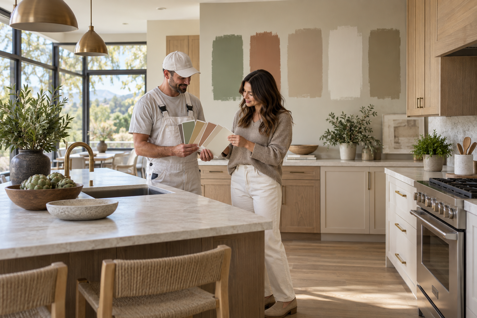
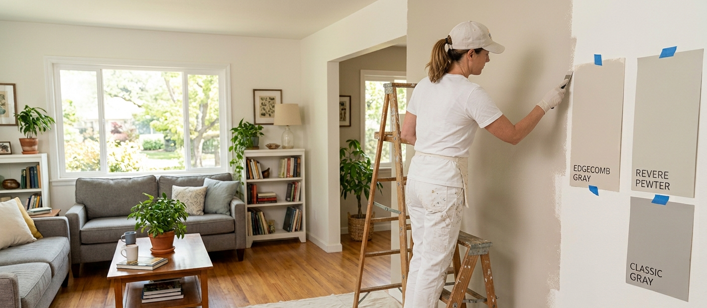
Testing paint is one of the easiest ways to avoid disappointment. Start by narrowing your options to a manageable number of colors. Apply sufficiently large samples so you can actually see how each shade behaves. Small dots of paint are rarely enough. Evaluate the color near flooring, trim, furniture, cabinetry, and other permanent surfaces. Check more than one wall if possible because different walls receive different amounts of light. Most importantly, give yourself time. A color that looks perfect at noon might feel completely different at night. Professional Interior Painting Chico planning should account for these changes before an entire room is painted. Spending a little extra time testing colors can save the inconvenience and expense of repainting a room because the final shade does not look the way you expected.
Why Choose SGB Custom Painting
At SGB Custom Painting, we believe choosing interior paint should involve more than pointing to a color on a sample card. We look at how the complete room works together, including natural light, flooring, trim, existing finishes, adjoining spaces, and the atmosphere homeowners want to create.
Preparation is also an important part of achieving a quality finish. Paint can change the appearance of a room dramatically, but the condition of the underlying surface affects how professional that finished result looks.
Our approach is based on clear communication. Homeowners should understand their options and feel comfortable with the direction of the project before painting begins.
For homeowners exploring Interior Painting Chico, we encourage thoughtful decisions rather than automatically following popular color trends. A shade that looks beautiful online may not work with your particular lighting or existing finishes. The goal is to create a finished space that works for your actual home. Whether that means a soft neutral palette, subtle color, or a more distinctive design choice, careful planning can make the result feel intentional and connected.
Frequently Asked Questions
Should the ceiling be lighter than the walls?
A lighter ceiling can help create an airy appearance and may make the ceiling feel less visually heavy. However, using the same or a related color on the walls and ceiling can also work in certain rooms.
Does painting walls and trim the same color make a room look bigger?
Using the same or closely related colors can reduce visual boundaries. This continuity may help a compact room feel less divided and more open.
Can dark colors work in small rooms?
Yes. Dark colors can create depth and a sophisticated atmosphere when they are chosen intentionally. Lighting, furnishings, and surrounding finishes should all be considered.
What paint finish makes a room look bigger?
There is no single finish that automatically makes a room look larger. Eggshell and satin provide some light reflection, while matte finishes create a softer appearance. Choose based on room function, surface condition, and the desired look.
How do I choose paint colors for an open floor plan?
Start with a coordinated palette rather than choosing each area independently. Use colors with compatible undertones and consider where natural architectural transitions allow one color to change into another.
Final Thoughts
Interior Paint is one of the simplest ways to change how a room feels without changing its actual dimensions. The right combination of color, lighting, undertones, ceiling treatment, and contrast can make compact rooms feel brighter, calmer, and more connected. You do not have to paint every small room pure white. Soft neutrals, muted colors, and even deeper shades can work when they complement the lighting and surrounding finishes. The most important step is considering the room as a whole. Look at your flooring, furniture, trim, ceiling, windows, and adjoining spaces before making a final decision.
For homeowners considering Interior Painting Chico, testing colors under real lighting conditions can be particularly valuable. Take your time, observe the samples throughout the day, and choose a palette that makes your home feel comfortable rather than simply following the latest trend. A thoughtfully selected paint color will not add square footage, but it can completely change the way you experience the space.
Find the Right Interior Color for Your Home
If you are ready to refresh your interior but are unsure which colors will complement your lighting, finishes, and existing spaces, reach out to SGB Custom Painting to discuss your project. We can help you explore practical options and create a finished space that feels brighter, more connected, and comfortable to live in.
Follow our social media pages below:
About SGB Custom Painting
SGB Custom Painting is a trusted Chico Painting Contractor known for clean prep, clear communication, and color that holds. For more than twenty five years, our local team has delivered interior, exterior, and cabinet projects for homes and businesses with careful protection, proper priming, and tidy jobsites. We follow EPA lead safe practices on older properties, keep schedules dependable, and give every project the respectful touch the North Valley deserves.

Love Your Space Again, Starting Today!
Locally Owned & Operated • EPA Lead Safe Certified • CSLB Licensed
Call 530-924-4109 or complete the form and expect a friendly call to confirm scope, discuss color options if needed, and deliver a no surprise estimate you can approve with confidence.
Contact Us
Refresh Your Home With Professional Painting
If you are thinking about repainting your interior, freshening up exterior siding, updating tired kitchen cabinets, or giving your business a cleaner look, our team is here to help you plan it right and paint it to last. Reach out to SGB Custom Painting to talk through your project, get honest expert guidance, and take the next step toward a home or workspace you will be proud of every day.
Follow Us
Elevate Your Space with SGB Custom Painting